

Resources for this post:
In 2018 I started a project with Tim Shanassy at Kolbe Catholic College. Our aim was to minimise the ‘tail’ (or lowest achievers) of our ATAR students, and to empower every ATAR student to raise their performance by just 1%.
At the end of 2021 Tim and I presented at the CEWA webinar week, we talked about our vision and demonstrated our Power BI dashboard.

The ATAR Predictor dashboard built in Microsoft Power BI.
I have continued this work at my latest school throughout 2021 and it has initiated many interesting conversations with both students and staff. This tool can motivate students, guide parents and keep teachers informed regarding a student’s performance and potential.
In the interest of privacy I decided to re-create this dashboard using anonymised data and Google DataStudio so I can demonstrate the workflow to you:
https://datastudio.google.com/reporting/65bb60b4-31a4-4965-bc68-bb9b69047f00

The ATAR Predictor dashboard built in Google DataStudio
What is the ATAR Predictor dashboard?
The dashboard monitors a student’s progress across the 2 year journey of ATAR. The 4 tables each represent a semester and the student’s performance across each ATAR subject. The predicted scaled score is shown, as is the 10% bonus if applicable. The Subject Aim column shows the required Final Scaled score aim, if that student is to reach their minimal potential (ascertained from Y09 Naplan performance).
The line graph shows the predicted ATAR outcome at each semester as a result of their School Assessment scores. The final large number beneath the circle shows the median score of the ATAR predictions across each semester.
How does Naplan come into this?
The first page (ATAR/Naplan Summary) shows a scatter graph, and our first use of simple linear regression. The x-axis shows historical Year 9 Naplan median score. The y-axis shows that historical student’s ATAR outcome. The assumption here is that we can estimate a student’s potential from their Y09 Naplan score. To be clear, this is not a prediction. It is simply an indication of a student’s potential, it is also the last standardised test that a student takes before ATAR.
So, once we ascertain that potential ATAR outcome, I added one standard deviation to give that student a window of achievement to aim for. In the image above that is between 82.9 and 92.8. Two years of testing this theory has demonstrated that this is a sweet spot that extends all students well.
So how did I make a prediction of a student’s scaled score and ATAR outcome?
Each year TISC will share an amazing document with each school that has details like the below image:
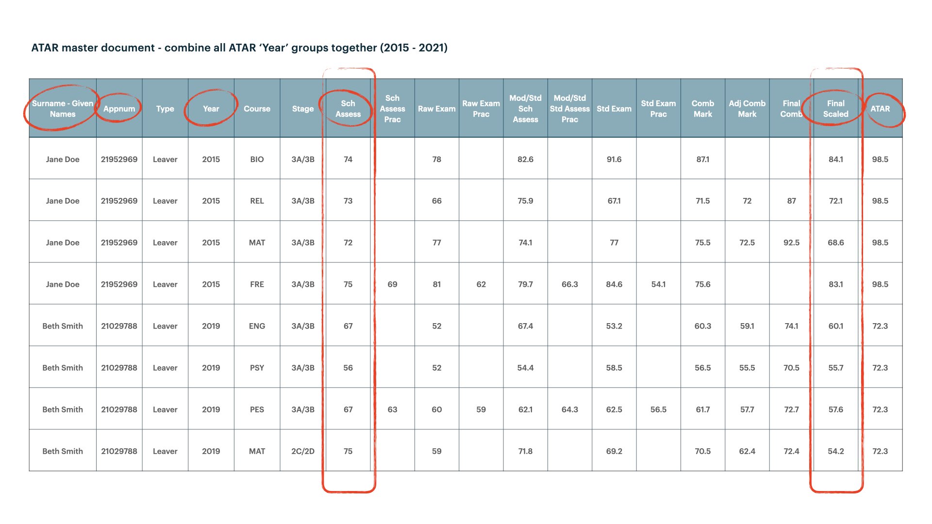
TISC will provide your school with this spreadsheet
Each year’s file will have about 400 rows and it is important to combine each year’s data to give us around 2000 observations. This data becomes incredibly rich!
We can establish a linear model between School Assess -> Final Scaled score for each Course. Remember that we know our current Year 11 and Year 12 school assessment scores. So using this historical data on scaling, it is possible to predict what a school assessment score will be scaled to.
Let’s take the course ENG as an example. The image below clearly shows a positive correlation between the School Assessment Score and the Final Scaled score. The Pearson Correlation value is 0.86.

There is a strong positive correlation between School Assess and Final Scaled
If a current student is achieving a Year 11 English score of 65, our historical data tells us that this will be scaled down to about 58.
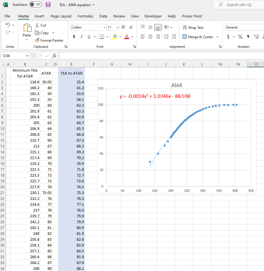
So how do we get an ATAR score from scaled assessment scores?
To be very brief: we take a student’s top 4 scaled scores, add any applicable bonus points and that gives us a TEA score. TISC give us a good clue on how they go from TEA score to ATAR in this post. So we just need a formula derived from these data, and Excel can help us to do this. The equation is highlighted in red in the image below.
But so what!!
I brought all of this work together into the dashboard that you have access to. Making these predictions wasn’t that ground-breaking for most of the teachers that I work with. But eventually is started to assist with a few important things:
Parent meetings and recommendations regarding subject selections became very highly informed and evidence based.
Students began to see their own potential from their year 9 performance and they became re-engaged. It can be hard to compare students against each other, but when they were being compared to themselves, on occasion they would respond well.
Students can quickly see their own progress, and they can adjust to those subjects that require greater attention.
We had a way to view all student performance across a year group. This assists when you need to make an informed decision concerning a DUX or similar award.
Follow up post with tech details coming next
I will follow up in another post with more detail regarding the development of the R code, how you can easily obtain your current student scores and how you can put it together to make a dashboard. I wrote the R code to be scalable, so it should work school data no matter how few or how many ATAR subjects are offered.